The Sprout House
Blending the fundamentals of mindfulness, yoga, and early literacy
Consulting, Brand Strategy, Brand Design Intensive, Squarespace Web Design Intensive — Richmond, Virginia

Brand Evolution
Where The Sprout House Began…
Caroline Simmons had a big idea: that kids who struggled with reading didn’t need simple tutoring: they needed mindfulness. She wanted to create a tutoring program that combined early literacy, yoga, and mindfulness to help kids reach their goals and set children up for whole life success. This idea represented a culmination of her professional experiences as an educator and my passions for movement and mental health advocacy.
Where The Sprout House Is Headed…
We got to start from scratch with this brand and an important piece to Caroline was silliness. Kids learn best when they are having fun. Her intention for the business is to equip little ones and their caregivers with tools and techniques that help them thrive, no matter the circumstance. We needed to balance the playful nature of Caroline’s teaching style with the message that she could get the results that parents were after.
Brand Keywords
Playful — Holistic — Expressive

Target Audience
Mary, 34, is a mom of a kindergartner, Sam, who is having a tough time grasping the fundamentals of reading. She is deeply invested in her child’s development (academically, emotionally, and physically). She is a thoughtful, hands-on parent and is eager and willing to invest in programs that will help set her kid up for success.
She is regularly on the hunt for enrichment activities that will help Sam become more well-rounded. She values community and is a strong word of mouth influencer. She is often overwhelmed with decision-fatigue when it comes to selecting camps and activities—too many options and choices with similiar offers makes it hard to decide the best fit.
She does struggle with feelings of inadequacy as a mother and puts a lot of pressure on herself to “do things right”. She craves reassurance, direction, and expert support.
She understands the key roles that mental and physical health play on academic achievement. She hopes to instill that awareness in Sam, starting now. It’s something she wishes she could have had herself.
A real win for her is finding a program that Sam genuinely looks forward to attending—and simultaneously gives him a sense of community and individualized attention.

Visual Rationale
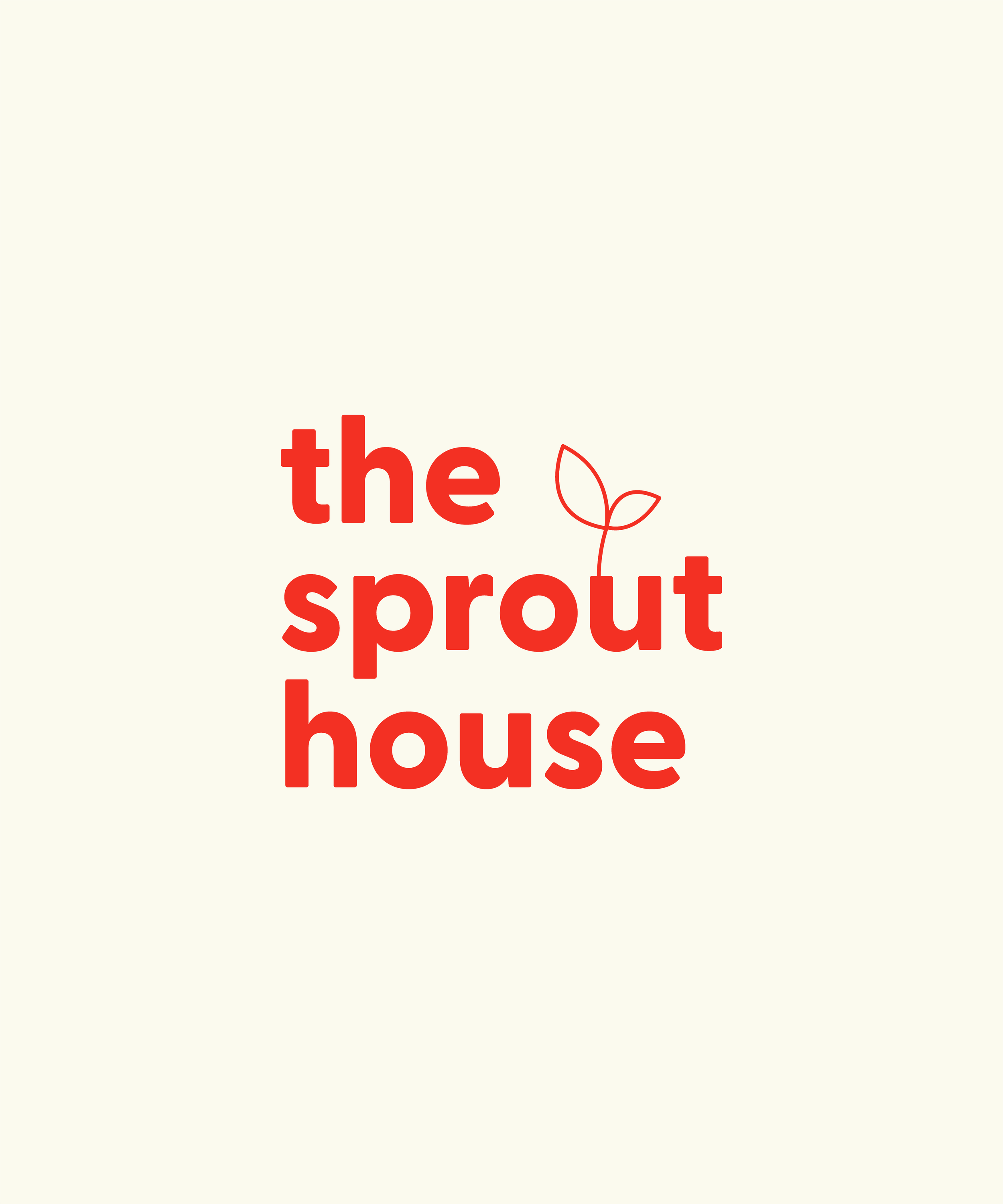
We wanted the visual identity to speak to both children and grownups alike. We chose playful colors, but not ones that are explicitly primary, like most children’s products. The sprout growing out of the letter “u” indicates just the very beginning of growth, a foundation for children to blossom from. The growth is for not just the children, but the entire family.
We softened the edges of the bold sans serif font, expressing approachability. The submarks appear to be in motion themselves, a nod to the movement involved in the program.

If you’ve made it this deep into our site, you probably already know that collaboration is our favorite. This project was a team effort with the help of Green Chair Stories on copywriting.